Picturing Giza
A Closer Look at the Change
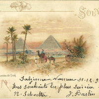
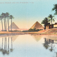
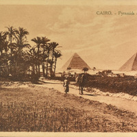
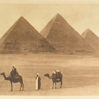
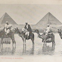
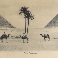
In each image that was selected, we attempted to showcase the different perspectives that the postcards depicted. We chose images that displayed either photographs or illustrations and divided them into categories of colored, sepia, or grayscale. We did this because we wanted to present how the style the postcards were done in changes the overall feel for the image. Colored illustrations created a more romanticized and dreamlike feeling, where as grayscale photographs presented a more sharp and cold perception.